Thank you to Nadya Khoja for creating and allowing us to share this crucially important piece of a successful content marketing campaign. The measurement of data is as important as the content itself and Nadya does a wonderful job of breaking down the areas you need to be assessing.
By giving you ways to improve the key points that are contributing to your success, or lack of and stopping you wasting time on fruitless pursuits you are given the missing part of the puzzle you are struggling to complete.
To learn more from Nadia and get actionable tips to help you on your road to success just go to thisisnadya.com
How to Measure Your Content Marketing Engagement (And Why it Matters)
Raise your hand if you’ve ever felt personally victimized by Google for not ranking your content?
Now raise your hand if you create a lot of content, and stuff it with keywords and still see very little improvement.
That’s what I thought.
But don’t be discouraged. You’re actually not alone in this, and a common mistake people make is focusing on creating a lot of content, rather than focusing on the quality of that content.
Let’s imagine you buy some blueberries at the supermarket (trust me, you’ll see the relevance of this soon).
There are 25 blueberries in this packet, and 20 of them are rotten, but 5 of them are at their perfect stage. If you’re like me, chances are you will probably pick through the rotten ones and only eat the select few that look good.
Plus, you’ll enjoy those 5 a lot more. It’s a fact, as can be seen in the following Blueberry Enjoyment Probability Chart (that I made up).
What does this have to do with content?
Nothing, I just wanted to talk about blueberries.
So let’s circle back to engaging content. Despite the fact that there are numerous articles, videos and resources stating the importance of quality and engaging content, what I’ve come to realize is that there are actually not enough good resources which actually state what that means.
How do you measure “engagement”?
What is engaging content?
Many resources you come across will attempt to explain the concept of “engaging content”, but the definition is often very subjective.
Recently I was looking at the website of a friend. He was asking for advice on scaling up his organic traffic, because he had seen how my team at Venngage had made a huge impact on our rankings by hyper-focusing on our content marketing efforts, and taking a very data-driven approach to how we produced that content.
When I looked through their blog, I realized that they had published over 8,000 articles! And as expected, almost 80% of those articles were driving absolutely NO traffic at all. Zero visits.

What my friend here had was a rotten blueberry problem. You see, there were somegood articles on the site, but they were hidden and buried beneath thousands and thousands of low-quality and unappealing pages.
I told you my blueberry story would be relevant.
His argument was that every one of those articles was “valuable” but as we could see, they weren’t valuable enough for people to actually “engage” with them.
And this is where I feel that there is a lack of understanding when it comes to measuring content engagement.
So I wanted to write this article in hopes that I can address not only how to measure whether or not your content is actually benefiting anyone, but also share some strategies for creating content that is more likely to rank organically.
Why is it important to measure engagement of your content?
This of course, is a multi-part answer. However I want to start by talking about engaging content as it relates to search rankings.
In layman’s terms, if the experience you are providing for your site’s visitors is crap, they will leave, or “bounce”. And if they “bounce”, Google sees that and thinks you’re probably not cut out to be the first thing people see when they are search for [insert keyword].
In other words, if you are creating a better experience, it will eventually result in better rankings and better conversions overall.
Typically, user experience is something that is very product focused, but not many content marketers think of applying UX principles to content strategy.
Usually what happens is that we focus on keyword optimization of content, and trying to create longer content because “some influencer” told us to do that, etc, etc, etc.
All of these things do in some sense correlate with a better content experience, but it’s different for every audience and every product.
But how do you measure content engagement anyway?
Keeping in mind that higher “engagement” is really just a component of a better user experience, then we can assume that creating more engaging content can result in better organic rankings, right?
So if user experience for content is made up of various engagement metrics, and those metrics are trending up, we can assume that the probability of increasing in rankings is also higher.
Let’s use a formula to simplify this more and give our content UX a grading system:
UXc = Avg(Ex→ Ey)
UXc refers to UX of Content
Ex → Ey refers to engagement metric x through to engagement metric y.
Don’t worry, I’ll show you what I mean shortly, but first let’s start by understanding which metrics correlate with engagement.
Important metrics for content engagement
The main engagement metrics I like to focus on are:
- Time on page
- Pages per session
- Bounce rate
- Exit percentage
There are a few others that we measure at Venngage that are specific to our product. Since we are essentially an infographic and poster maker, we also measure the rate at which people create a visual from a template, as well as the rate of completion. On top of that, we look at various conversion metrics like registrations and upgrades to various plan types.
So we measure a few more things with our content efforts as well:
- Registration rate: Percentage of people who sign up from a specific page to become a free user.
- Upgrade rate: Percentage of people who upgrade to a paid plan from that page.
- Creation rate: Percentage of people who create an infographic or find a template from that page.
- Completion rate: Percentage of people who successfully complete an infographic from that page.
- Time on page: Average time spent on a single page.
- Pages per session: How many pages on average people visit in a single session.
- Bounce rate: The percentage of people who land on a page and rapidly exit leave that page.
- Exit percentage: The percentage of people who exit the site after landing on that page.

Tools for tracking your engagement metrics
Ok, so we’ve talked about which metrics are important, but now we need to touch on how to measure them, but more specifically how to measure them on an ongoing basis.
So far, what I’ve found to be the most effective way to measure content performance is using Google Analytics and Google Data Studio.
Since we are measuring content as it pertains to organic rankings, we want to only look at content performance from Organic.
If you are not currently driving enough traffic from organic, you can test your content via Adwords to get a baseline on the above metrics.
At a high-level, you can see which articles are driving the most traffic on a weekly or monthly basis.
Here’s a look at some organic traffic metrics from a few years ago at Venngage:
From this, we can already infer that the one Spanish article is performing much better than all of the other top ranking articles. The bounce rate is much lower, users on average have a higher pages/session number, the conversion rates are higher and the time on page is higher.
Although this is helpful in determining which articles are performing well, it’s not enough to monitor the change of those engagement metrics over time.
This is where Google Data Studio comes in handy.
Where analytics allows you to track the overall traffic and performance of your content, Google Data Studio allows you to see how specific content improves (or doesn’t) over time.
Here’s a look at how we set up our content at Venngage:

For each month, we track specific articles that were published during that time, and we also track which articles were updated in that specific month as well.
This allows us to see the improvement over time.
What this also means, is if we notice that some older articles aren’t performing as well as they should be (or at all), we can either decide whether or not we want to rework them. In some very rare cases we delete them altogether, but ultimately we try to avoid creating anything new just for the sake of pushing out more content.
More importantly, we can see where we are lacking efforts in terms of promotion. Newer content will not immediately rank, but the more we push that content, the quicker we see the metrics moving up.
Finding the correlations between high and low performing content
Of course, it’s not enough to just see the trends of our content, but we need to actively work towards tweaking underperforming content, and creating new blog posts that have naturally higher engagement metrics.
One way to take a data-driven approach to improving content is finding the correlations between what is engaging your audience, and what is not.

Step 1: Starting out with a keyword driven approach:
The number one reason I believe anyone should be creating content for a blog is with the goal of driving organic traffic. And that means, you need to be strategic in identifying what content to create.
A lot of people write and publish an article, and put a lot of effort into building links to that article, but see very little impact in their rankings. Part of that reason is they aren’t targeting a keyword (or series of keywords) that enough people are searching for.
When trying to come up with content ideas, it’s important to start with keyword research and build on that. I cover this process in more detail (albeit drunkenly) in this article and video on content ideas. Take a look, because this is an important first step before moving on to the next part of the process.

Step 2: Identifying high and low performing content
The next step is taking a look at the content on your site which is performing well (meaning the engagement metrics are high) and which isn’t (meaning the engagement metrics are low). You will want to run an audit on the top 5-10 articles and worst 5-10 articles.
Let’s go back to looking at the formula that was referenced above:
UXc = Avg(Ex→ Ey)
When running your audit, you will need to make sure that there is a decent sample size of visits coming to that page from organic. I’d recommend at the very least, 300 visits over a 2 week time frame.
Now let’s take a look at an example.
Here is a table of some of the above engagement metrics for low performing content, versus high performing content. Many of these are from historic Venngage data.
| Article | Sessions | Registration rate | Time on page | Pages per session | Bounce rate | Exit percentage | Average |
| 1 | 1,225 | 0.08% | 0:01:12 | 1.34 | 82.45% | 79.33% | 59.19% |
| 2 | 17,513 | 0.19% | 0:01:21 | 1.36 | 82.80% | 79.40% | 59.70% |
| 3 | 1,689 | 1.12% | 0:01:31 | 1.46 | 77.74% | 73.08% | 59.61% |
| 4 | 1607 | 2.30% | 0:01:39 | 1.53 | 79.96% | 77.61% | 62.60% |
| 5 | 551 | 2.90% | 0:01:22 | 1.59 | 79.13% | 72.69% | 62.76% |
| 6 | 1110 | 2.88% | 0:01:20 | 1.74 | 73.69% | 71.01% | 64.33% |
| 7 | 693 | 1.59% | 0:02:11 | 1.72 | 74.74% | 69.72% | 63.64% |
| 8 | 2,309 | 3.16% | 0:02:06 | 1.88 | 72.72% | 71.46% | 67.10% |
| 9 | 502 | 1.99% | 0:02:12 | 1.88 | 75.30% | 67.34% | 66.56% |
| 10 | 849 | 6.95% | 0:01:26 | 1.96 | 69.14% | 67.43% | 67.92% |
| 11 | 1,501 | 6.53% | 0:02:08 | 2.07 | 71.09% | 68.64% | 70.68% |
| 12 | 3,559 | 3.93% | 0:02:14 | 1.93 | 70.44% | 67.46% | 67.00% |
| 14 | 2,338 | 7.44% | 0:02:42 | 2.22 | 66.81% | 64.66% | 72.22% |
| 15 | 2,887 | 5.06% | 0:02:41 | 2.37 | 63.63% | 61.45% | 73.47% |
| 16 | 3,163 | 8.79% | 0:02:56 | 2.38 | 68.48% | 66.53% | 76.40% |
| 17 | 4,134 | 7.64% | 0:03:32 | 2.35 | 67.10% | 62.85% | 74.57% |
| 18 | 598 | 10.70% | 0:02:27 | 2.47 | 63.88% | 61.52% | 76.65% |
| 19 | 365 | 8.49% | 0:04:10 | 2.73 | 61.10% | 56.25% | 79.83% |
| 20 | 8,258 | 14.16% | 0:03:12 | 2.84 | 60.29% | 58.88% | 83.51% |
| 21 | 989 | 12.23% | 0:03:50 | 2.9 | 56.93% | 53.88% | 82.66% |
So the UXc grade for Article 21, for instance is 82.66% (or an A).The column on the right is the average score of every metric (not including the number of sessions). It isn’t a perfect system of course, but it can give you a general “grade” for your content.
Now you can move on to the next step, which is pinpointing which factors could be leading to that high grade point average.
Step 3: Pinpointing engagement factors in content
Not too long ago, Susan Su from Reforge called me up to run a qualitative content experiment in order to identify what people at top companies were actually reading. One of the main things that they learned was that the format of the content is as important as the topic.
This gave me an interesting idea.
What if we could manipulate our engagement data by better understanding whichformats of content people were more drawn to.
So we started running some focus groups with our content to figure out what it was about the formatting of various articles people liked the most.
By documenting these factors we were able to see if there were any correlations between the articles with a good grade, and those with a bad grade.
One of the main factors was text to image ratio. In fact, Brian Dean mentions that a single image in an article can increase your rankings, but the reality is that an image (or in this case, text to image ratio) increase the engagement of your article. This in turn correlates with better rankings.
So we decided to make some changes to 6 of our lower-graded articles and attempt to improve some metrics. On average, the time on page increased by 24% and the bounce rate dropped by 2%.
Here’s how you can pinpoint the engagement factors for your content:
- Start by doing an overview of the top graded and lowest graded content and comparing them at a high-level.
- Look for differences and similarities with titles, subheaders, paragraph length, number of images and types of images (we actually ran a study and found that on average, infographics in content lead to higher engagement).
- Call a few users who read your content and create a small focus group and show them different articles to learn what they consider to be more engaging.
- Document the most frequently stated factors and start implementing those changes into low-graded content.
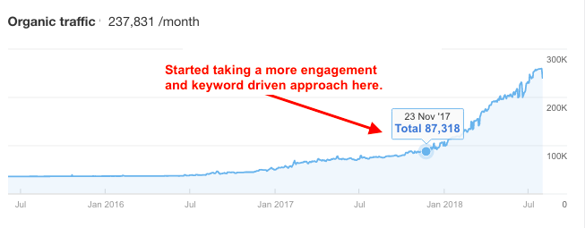
For us it is still early to tell exactly how well our tests are working, but by taking a keyword driven approach in combination with an engagement driven approach, we’ve seen considerable growth on our blog, as you can see here:
You need a data-driven approach to create more engaging content
To conclude, simply saying that you need to offer “value” is not enough to understand what makes for engaging content. You need to do a deep dive of specific engagement metrics and identify what factors of your content correlate with higher engagement and higher rankings.
Keyword stuffing is not going to work if you want to rank higher, and just looking at your engagement metrics won’t help either. You need both a keyword driven approach to your content strategy, while also making an active effort to score a higher content experience grade overall.
Have you noticed and practices that have lead to better engagement on your blog? Share your thoughts in the comments!


